Back to: User Interface (UI) Design Course
Subtitle for this Section
UI Elements
Put simply, UI elements are the building blocks used to create apps or websites. They’re individual ‘parts’ that provide interactive touchpoints, guiding the user around each page. UI designers use UI elements as a visual language that establishes consistency across a website or app. By having them there, users can navigate a digital product without thinking too much about what they’re doing.
There are four main categories of UI elements:
- Input controls
- Input elements
- Output elements
- Helper elements
- Navigation components
- Informational components
- Containers
Let’s look at these a little more closely.
- Input controls allow users to input information into the system. These include drop-down menus, forms, and buttons—just like you’ll be designing on your app screen.
- Navigational components help users navigate an app or website. These include a tab bar or hamburger menu.
- Informational components share information with users, such as a pop-up box or progress bar.
- Containers hold related content together.
1. Input Controls
UI elements are the components that make up the user interface of an application or website. Input controls are a type of UI element that allow users to enter or select data. Some examples of input controls are:
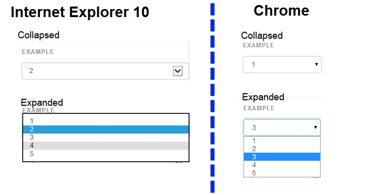
- Dropdowns
- Combo boxes
- Buttons
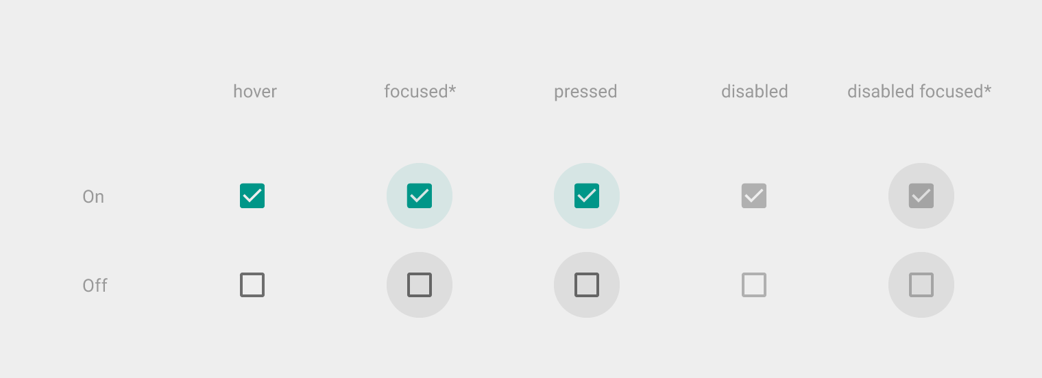
- Toggles
- Text/password fields
- Date pickers
- Checkboxes
- Radio buttons
- Confirmation dialogues
9 Common Input UI Elements
Here are nine of the most common input elements that every designer should know about. This list includes buttons, checkboxes, text fields, and you’re certain to find them in the most popular design systems, listed under UI components.
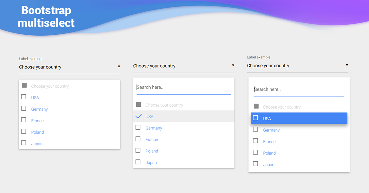
Checkboxes
Checkboxes allow the user to select one or more options from an option set. It is best practice to display checkboxes vertically. Multi-columns are also acceptable considering the available space and other factors.
Dropdowns
Dropdowns allow users to select one item at a time from a long list of options. They are more compact than radio buttons. They also allow you to save space. For better UX, it’s necessary to add a label and a helper text as a placeholder. I.e. “Select One, Choose, etc.”
Combo boxes
Combo boxes allow users to either type a custom value directly or select a value from the list. It is a combination of a drop-down list or list box and a single-line input field.
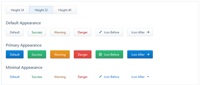
Buttons
Buttons allow the users to perform an action with touch or click. It is typically labelled with text, icon, or both. Buttons are one of the most important parts of a UI. So it’s important to design a button that the user will actually click.
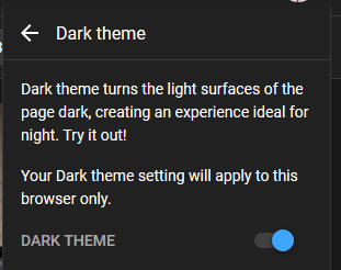
Toggles
Toggles allow the user to change a view/value/setting between two states. They are useful for toggle between on and off state or switching between list view and grid view.
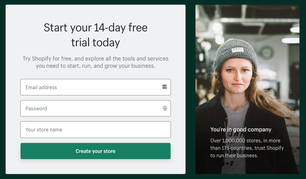
Text and password fields
Text fields and password fields allow users to enter text and password respectively. Text fields allow both single-line and multi-line inputs. Multi-line input fields are also known as “textarea”. Password fields generally allow single lines for a password.
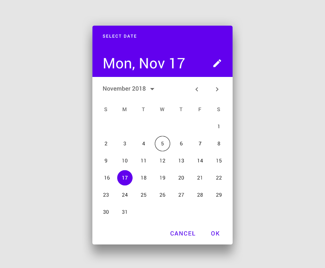
Date pickers
A date picker allows users to pick a date and/or time. By using a native date picker from the platform, a consistent date value is submitted to the system.
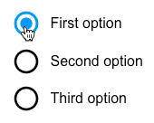
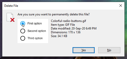
Radio buttons
Radio buttons allow users to select only one of a predefined set of mutually exclusive options. A general use case of radio buttons is selecting the gender option in sign-up forms.
Confirmation dialogues
Confirmation dialogues are responsible for collecting user consent for a particular action. For example, collecting user consent for a delete action.
2. 4 Common output elements
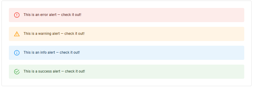
Alert UI Element
An alert presents a short, important message that attracts the user’s attention. It notifies users about these statuses and outputs.
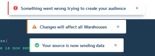
Toast UI element
This refers to a UI feature where an event (user input, server response, calculation etc.) triggers a small text box to appear on the screen. Ideally, it appears at the bottom on mobile and bottom left or right side on the desktop.
The difference between “Alert” & “Toast” is that the former doesn’t dismiss itself and the latter does after a certain time.
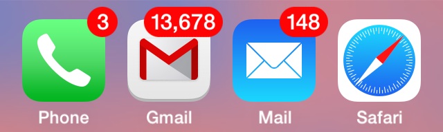
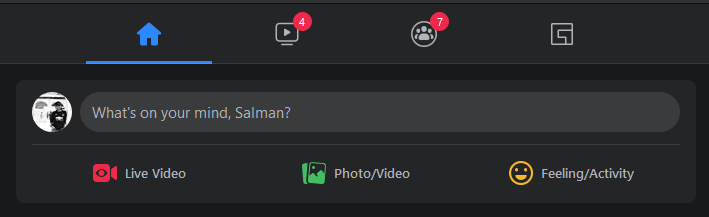
Badge
This feature generates a small badge to the top-right of its child(ren). In general, it represents a small counter or indicator. This can be something like the number of items over the cart icon or online indicator over a user avatar.
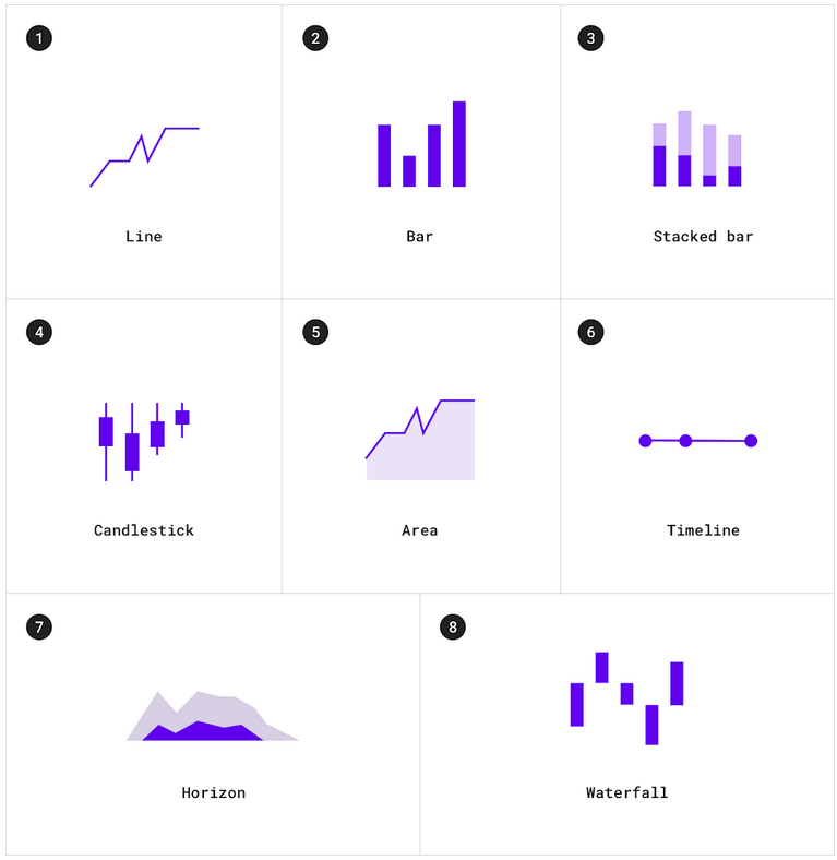
Charts
Charts are a common way of expressing complex data sets because they depict different data varieties & data comparisons.
The type of chart used in UI depends primarily on two things: the data we want to communicate, and what we want to convey about that data
3. Common Helper UI Elements
Navigational UI elements
Those elements aid navigation. They are
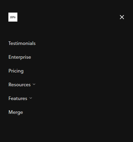
- Navigation menus
- List of links
- Breadcrumbs
- Search fields
- Pagination
Navigation menus
This is a navigational UI element with several values that the user can select. They are taken to another area of the website/app from there.
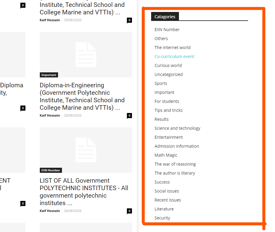
List of links
As the name suggests, a list of links consists of links. Sidebar with a category list is a good example of this. Links can be both internal and external.
Breadcrumbs
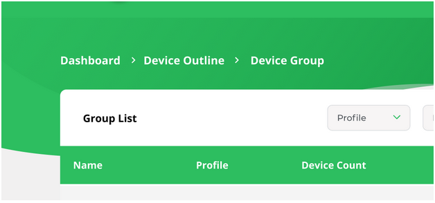
Breadcrumbs allow users to see their current location within the system. It provides a clickable trail of proceeding pages to navigate with.
Search fields
A search bar is usually made up of two UI elements: an input field and a button. It allows users to enter a keyword and submit it to the system expecting the most relevant results.

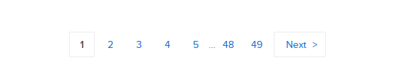
Paginations
This feature divides the content between pages and allows users to navigate between them.
4. Informational UI elements
That category of UI elements transfers information. It comprises:
- Tooltips
- Icons
- Progress bars
- Notifications
- Message boxes
- Modal windows
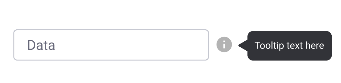
Tooltips
A tooltip shows users hints when they hover over an element indicating the name or purpose of the item.
Icons
It’s a simplified symbol that is used to help users to navigate the system, presenting the information and indicating statutes.
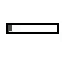
Progress bars
A progress bar indicates the progress of a process. Typically, progress bars are not clickable.
Notifications
It is an update indicator that announces something new for the user to check. Typically shows completion of a task, new items to check etc.
Message boxes
It’s a small window that provides information to users but typically doesn’t prevent users from continuing tasks. Message boxes perform tasks like showing warnings, suggestions, etc.
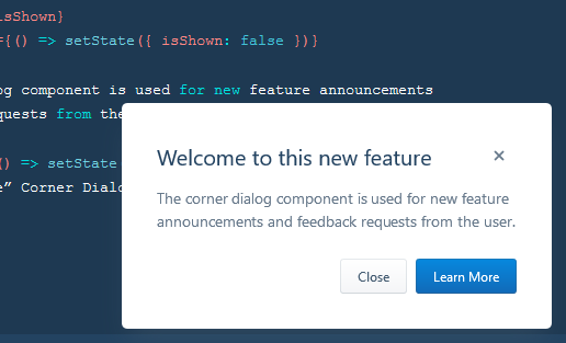
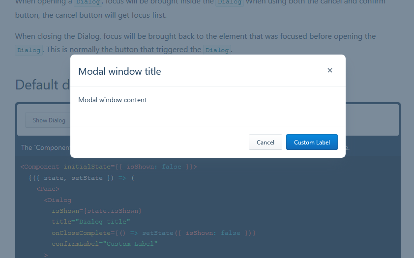
Modal windows
It’s used to show content on top of an overlay. It blocks any interaction with the page — until the overlay is clicked, or a close action is triggered.