Back to: User Interface (UI) Design Course
Introduction
Interaction design is a crucial aspect of user interface (UI) design. It is the process of creating and designing digital products that are easy to use, intuitive, and effective. In this module, we will focus on three key elements of interaction design: buttons, navigation, and forms.
Buttons
Buttons are one of the most important elements in UI design. They are used to initiate an action or to navigate to another page or screen. Buttons should be easy to locate, and their purpose should be clear. Here are some best practices for designing buttons:
- Use clear and concise text on buttons.
- Ensure that buttons are large enough to be easily clickable.
- Use colors that contrast with the background to make buttons stand out.
- Provide visual feedback when a button is clicked.
Navigation
Navigation is the process of moving through a website or application. Good navigation is essential for providing a positive user experience. Here are some best practices for designing navigation:
- Use a consistent navigation system throughout the website or application.
- Make sure navigation labels are clear and concise.
- Use descriptive labels for navigation links.
- Use visual cues such as arrows to indicate dropdown menus.
- Provide a search function to help users find what they are looking for.
Forms
Forms are used to collect information from users. They can range from simple contact forms to complex multi-step forms. Good form design is essential for encouraging users to complete the form and submit their information. Here are some best practices for designing forms:
- Use clear and concise labels for form fields.
- Provide examples or placeholders to help users understand what is expected in each field.
- Use validation to ensure that users enter the correct information in each field.
- Use clear error messages when a user enters incorrect information.
- Break long forms into smaller, more manageable sections.
Let’s explore the types of buttons:
CTA button
A call-to-action (CTA) button is an interactive element of a user interface that’s aimed at encouraging a user to take a certain action. This action presents a conversion for a particular page or screen (for example buy, contact, subscribe, etc.), in other words, it turns a passive user into active. So, technically it can be any type of button that is supported with a call to action text. What differentiates it from all the other buttons on the page or screen is its engaging nature: it has to catch attention and stimulate users to do the required action.
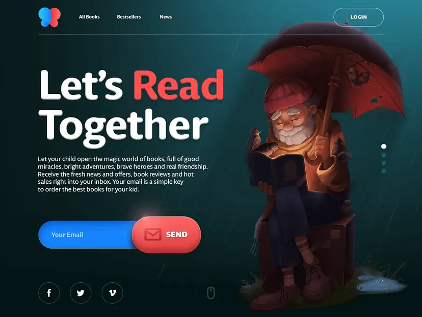
Here’s the home page of an e-commerce website selling books for kids. At the featured slide, there is one core action set as a goal for the page: getting a user to subscribe to the mailing list sharing.
So, the button is designed as one of the most noticeable elements of the layout so that the user could instantly see how to do the action as soon as he or she is willing to do it.
Text button
Here the terminology is transparent: it’s a button presented with a piece of text. It means that the copy isn’t integrated into any shape, filled tab, or anything like that. Text buttons are usually used to create secondary interactive zones without distracting from the main controls or CTA elements.
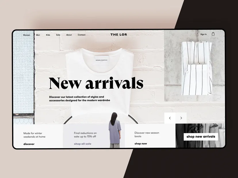
Here’s an elegant website design for a fashion store. As you can see, the interactive part of the layout is based on text buttons. Only the main CTA element is presented as an easily decoded button. All the others feature only copy in both header and tabs for offers. Such an approach supports the general light and minimalistic style of the webpage.
Dropdown button
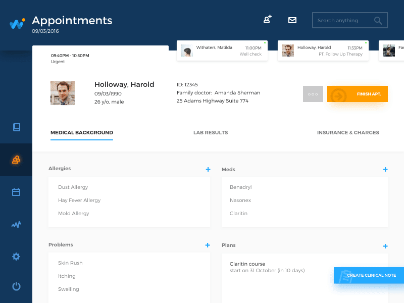
Dropdown button, when you click it, displays a drop-down list of mutually exclusive items. You can often come across this type in the settings button. When a user chooses one of the options in the list, it’s usually marked as active, for example by color.
Dropdown button, when you click it, displays a drop-down list of mutually exclusive items. You can often come across this type in the settings button. When a user chooses one of the options in the list, it’s usually marked as active, for example by color.
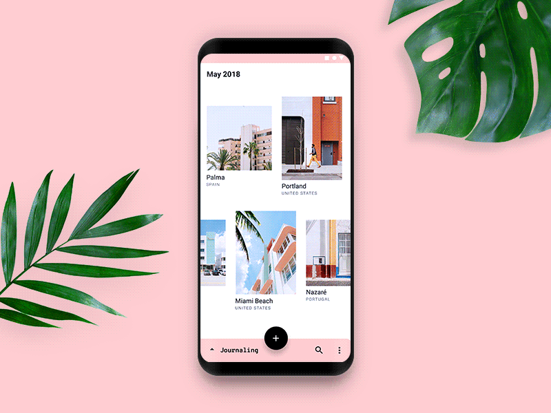
HealthCare app interaction flow shows the buttons opening the lists of details a doctor can add to the particular bill: when the button is clicked, it opens the dropdown list of options. As soon as you choose one, the big button disappears leaving the option chosen and the small plus button in case you want to check the list once again.
Hamburger button
It is the button hiding the menu. When you click or tap it, the menu expands. This kind of menu (and button as well) got such a name due to its form made of three horizontal lines that look like typical bread-meat-bread hamburger. Today it is a widely used interactive element of web and mobile layouts; still, debates about its pros and cons are still hot.
Here’s an example of a website using the functionality of a hamburger menu. It allows for hiding the extended menu of options to concentrate the user’s attention on impressive visuals and core information.

Plus button
Being clicked or tapped, plus button enables a user to add some new content to the system. Depending on the type of app, it can be a new post, contact, location, note, item in the list — anything that is a basic action for the digital product. Sometimes, tapping this button, users are directly transferred to the modal window of creating content
Expendable button
This button opens a variety of options after being clicked or tapped. It is one more way to set the proper flow of interactions without overloading the screen, which is particularly important for mobile interfaces limited in screen space.
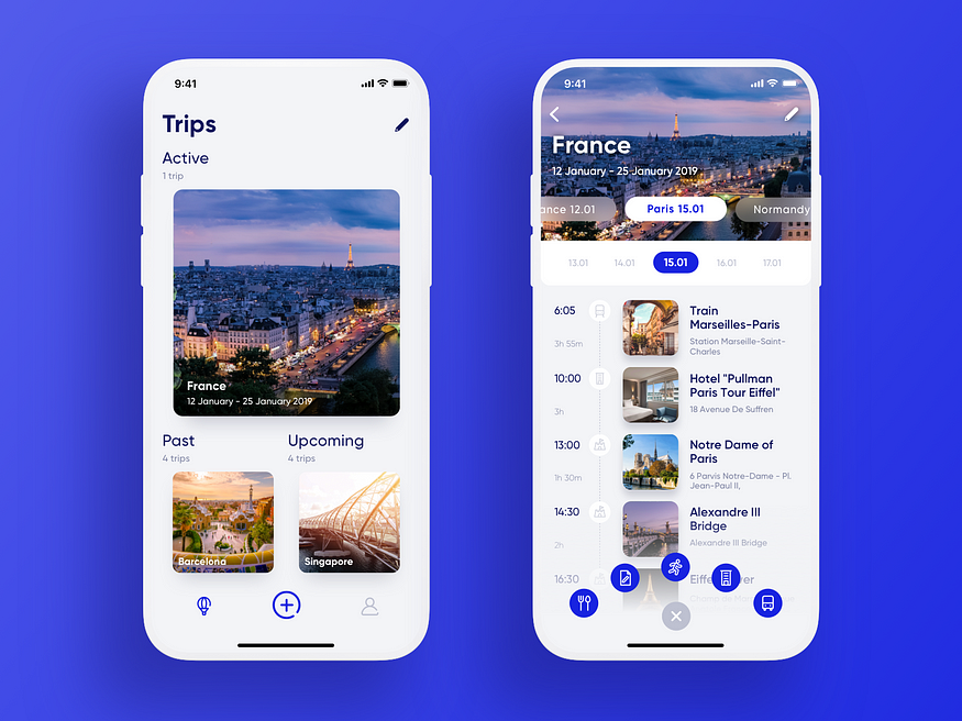
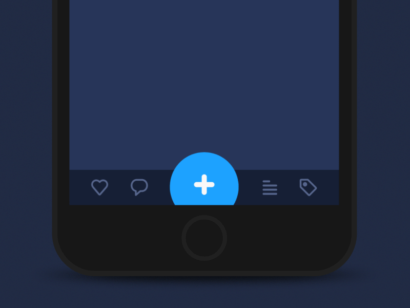
Here’s the Travel Planner application: the central interactive element of the tab bar is a plus button allowing a user to add a new trip or a new item to the particular trip. To make the experience simpler, the button is expanded into a set of buttons marking definite types of content, so that the user could make the choice at the start and reach the necessary screen.
Share button
With the high popularity of social networks, chatting, and emailing, these buttons simplify the process of connecting an app or website content to a user’s social profiles. The button of this type enables sharing the content or achievement directly to social networking accounts. To make the connection clear, it is presented with icons that feature a brand sign of particular social networks and are easily recognizable.
Ghost button
Ghost button is a transparent button that looks empty. That’s why it is also called “empty”, “hollow” or even “naked”. Its visual recognizability as a button is typically provided with a shape bordered by quite a thin line around the button copy. This kind of buttons helps to set the visual hierarchy in case there are several CTA elements: the core CTA is presented in a filled button while the secondary (still active) is given in a ghost button.
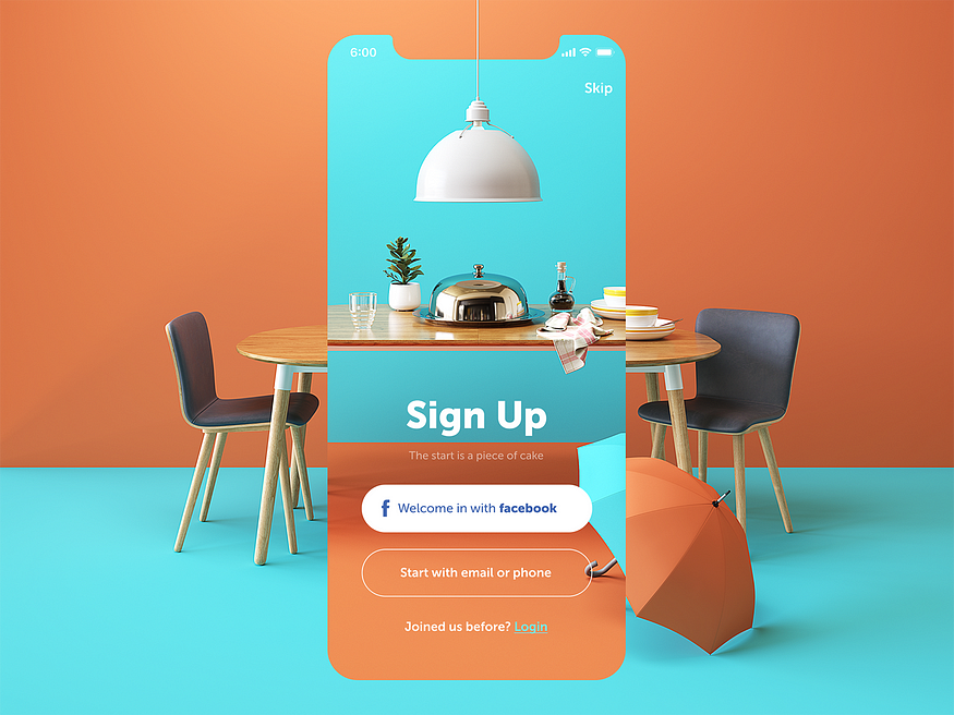
Here’s the sign-up screen for a restaurant app. It features buttons of three different types: the core CTA is presented with the filled button that offers the most popular and easy way to sign up quickly; the ghost button offers access to less popular option; the text button is integrated into the next line as an answer to a question and marked with color. Such an approach helps to build a solid visual hierarchy of the buttons on the screen.
Floating Action Button (FAB)
In Material Design, the floating action button (FAB in short) is the button that presents the primary action on the app screen. Typically, it’s a round icon button elevated above other page content. This button usually gives instant access to essential or popular actions users do with the app. Depending on the design and information architecture of the mobile application, FAB can:
- perform a typical core action (open the screen of new email, open the screen of adding the photo or video content, search the needed content in the gallery, etc.)
- show additional actions
- transform into other UI elements.
Here’s a flow of interactions for travelers diary applying bottom app bar, overlapping FAB, and woven image list.