Back to: User Interface (UI) Design Course
1. What is an example of bad UI?
A bad UI is any UI design that the user finds difficult to navigate, is confusing, or frustrating to interact with.
Common faults of bad user interface design include pointless inconsistency in UI elements, little distinction between primary and secondary buttons, a lack of text hierarchy, bad iconography, unaligned elements, low contrast, confusing forms, poor touch target on mobile and tablet, and using irrelevant or low-quality images.
2. What makes a UI good or bad?
The difference between good and bad UI is how easy it is for the user to achieve their goals: good UI should be easy to understand, consistent, responsive, accessible, and offer feedback to the user while they use it.
3. What is a UI problem?
A UI problem refers to any issue or difficulty encountered in UI interface that can lead to a poor user experience.
Confusing navigation, inconsistent design elements, a poor layout, and slow response times, are a few examples of possible contributors to a UI problem.
Examples of good and bad UI Design
The power of UI design is such that it can mean the difference between a very successful application and one that fails to make an impact—or worse still, leaves a memorably bad impression on the user! When it comes to creating high-quality apps, all of the small details are crucially important. If you are just starting your design career, being aware of these mistakes will prove invaluable.
1. Pointless inconsistency in your UI elements
To ensure a smooth and concise app, avoid using too many different styles. This will send mixed signals to your users! The key is repeating patterns and elements any time you can. A consistent-looking design goes a long way in establishing trust with your visitors and in creating an enjoyable experience. Plus, it will help your users learn their way around your app much faster.
To avoid inconsistency, keep an eye on the following elements:
- Consistent use of color palette for elements like buttons, text, links, header, footer, hover states, etc.
- Consistent font styles for titles, paragraphs, links, etc.
- Use either rounded or squared corners for the shapes in your app: Icons, cards, buttons, etc.
- Consistent line thickness: for icons, dividers and any other lines you use.
- Every element that deviates in any way must have a reason to do so.

2. Using the default drop-shadow
Less is more when it comes to drop-shadows. I always advise against over-using them or you will end with a very busy, noisy design. But if you must use them, then follow these tips:
- Don’t use the default drop-shadow, it is meant to be adjusted.
- Make it very subtle. Don’t use black for drop shadows as it is a very harsh color, instead use a darker version of your background color; this will look more natural.

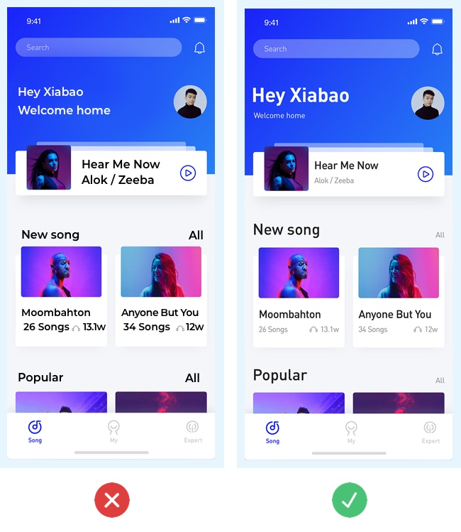
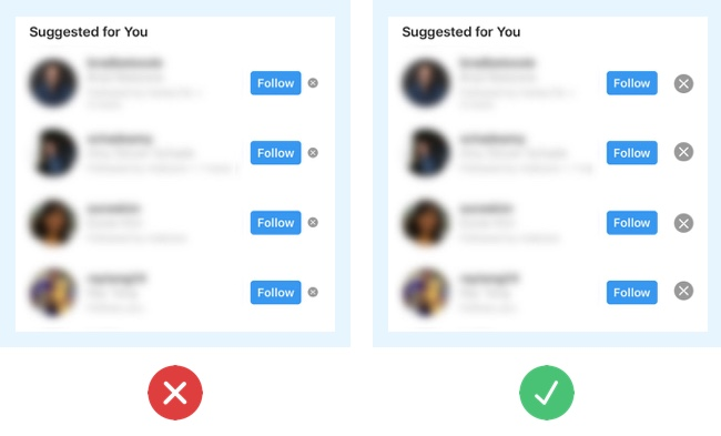
3. Little distinction between primary and secondary buttons
When working with apps, you will have many actions that the user is able to complete. It is important to give visual importance to the primary actions. All the navigation happens through buttons, so you have to make it easy for the user to identify the primary buttons by making them bold and prominent. Secondary actions should be less prominent but still visible if the user is looking for them.
Here’s how to distinguish between primary and secondary buttons:
- Use different visual weight for primary and secondary buttons. The button with the strongest visual weight will get more attention.
- So use strong colors, bold text and size to give visual weight to primary buttons. Do the contrary for secondary actions.

7. Low contrast
Contrast is everything on a visual composition. When you have low contrast between your interface elements, all of the elements merge together and you end up with a dull and hard-to-read interface because it all looks the same. Low contrast is equal to low usability.
When it comes to contrast in UI design, follow these tips:
- Use contrast to guide the user’s attention through your interface. For example: use high contrast color for calls to action.
- Use contrast to clearly separate the different sections of your app. For example: use different background colors to show a clear difference between header, content, and footer.
- Use contrast to separate elements from the background. Example: Photos with text on top can be hard to read, so ensure your text will be legible by having high contrast between your photo and text.
- When in doubt, use this website to check if you have enough contrast between 2 colors.

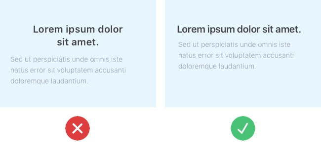
4. Lack of text hierarchy
Text is the primary unit of informational content, which is exactly the reason why it must always be legible and organized. Properly formatted text facilitates users’ perception of information.
Our job as designers is to organize this in the most digestible and comprehensive way.
Here are some things to keep in mind:
- Have plenty of contrast between each style title: Use size, weight, and color to separate each style.
- For information hierarchy to be clearly visible, always start with a big title which should be the most prominent element of the page. Sub-headers and other text should be considerably smaller, and so on.
- Use adequate spacing and kerning.
- Separate your blocks of text clearly, use small amounts of space to connect related information and use lots of space to visually separate different blocks of information.
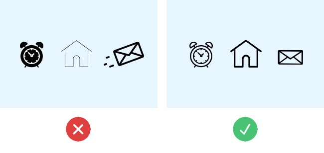
5. Bad iconography
Sometimes icons seem to be the “easiest” part of the design. Some designers even see them as an “extra” decorative element, when in fact they are also a fundamental part of modern interfaces. Especially on mobile where icons are the equivalent of buttons (just take a look at Snapchat) you will find an interface that is mostly made of icons.
That’s why it is so important to choose the right “symbol” that clearly communicates the element’s meaning, and to keep a consistent style for the icons throughout your app.
When it comes to iconography, follow these tips:
- Use vectors / SVG for your icons. It’s the easiest way to ensure your icon will look sharp in any device or resolution.
- Use a consistent style: First of all, all of your icons should either be outlined or filled. In addition, ensure a consistent line thickness and corner radius.
- Ensure the message of your icon is clear.
6. Unaligned elements
I’ll admit it, I’m an alignment freak. But that’s only because once you discover the power of aligning things, you realize that it is the key to making any layout look beautiful and balanced.
There are two fundamental ways to help you organize your interface: a 12 column grid and a baseline grid. Both are invisible in the final design, but they are critical to having a balanced interface.
Many designers think using a grid can restrict your creativity, and in a way, it is true. However, if you are just starting out as a UI designer, I believe it is necessary to first learn the rules before you break them.
Here’s a top tip for alignment in UI design:
- Don’t align related items to different sides. Always try to aligning related elements to the same side because it connects them visually.
9. Poor touch target on mobile and tablet
Small touch targets are frustrating because they can make it difficult for the user to complete their desired action. We’ve all experienced the frustration of tapping the wrong button on our smartphone and having to wait while the wrong screen loads!
So, when designing clickable elements, remember that users come equipped with different sized fingers:
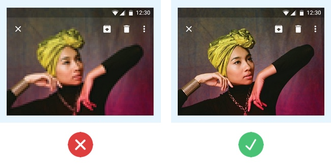
10. Using irrelevant or low-quality images
Photos in your interface will help to tell a story, so choose a strong image that will complement the story and the look of your app.
Bear these tips in mind when choosing images:
- Avoid irrelevant photos. Show photos related to your service or product.
- Use high-quality images only.
- Choose creative and realistic photos. Avoid fake or staged stock photos.