Back to: User Interface (UI) Design Course
Grids & Layout Patterns
UI layout patterns are pre-defined templates or designs that help designers create a visually appealing and user-friendly interface. These patterns are based on the best practices in UI design, and they provide a structured approach to organizing information and guiding users through the interface. Some of the commonly used UI layout patterns are:
There are a few criteria that make UI patterns endure. User-friendliness is one of them. A web UI design pattern that “looks amazing” but doesn’t facilitate great usability is not one that will last for long.
The most useful UI patterns are also adaptable to changing trends. Card-style and grid-based layouts, for example, can be implemented by UI designers in a variety of ways. Adaptability makes it possible for them to continue looking modern and on-trend, even though they may have been around for years.
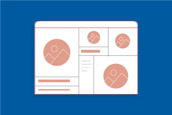
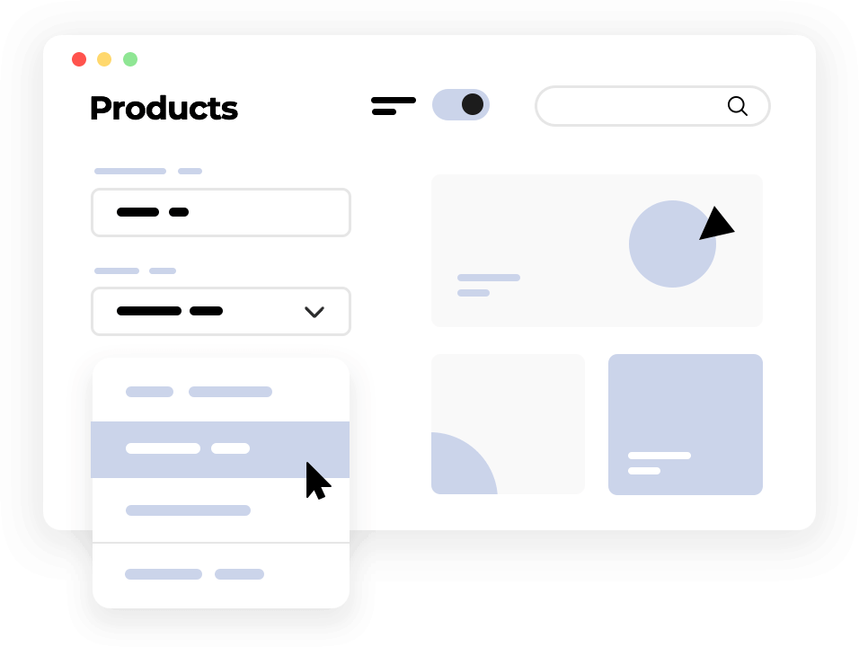
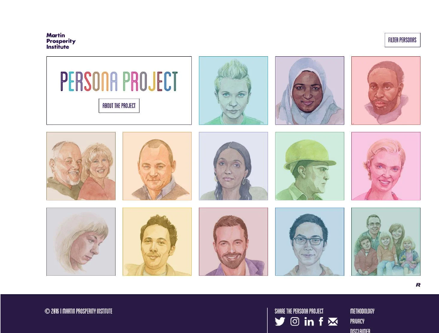
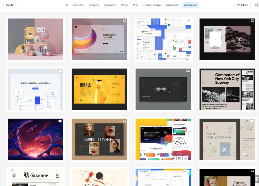
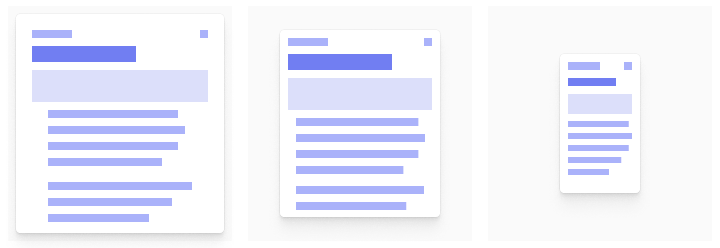
Card-style Web Layout Patterns
Cards are important in UI layout design because they blend text and pictures and are particularly beneficial when you want a user to peruse the content of various types and lengths.
Card-style layouts were popularized by sites like Pinterest, Facebook, and Twitter. They have become standard on news sites and blogs, as they’re well suited to placing a lot of content on a page while keeping each piece distinct.
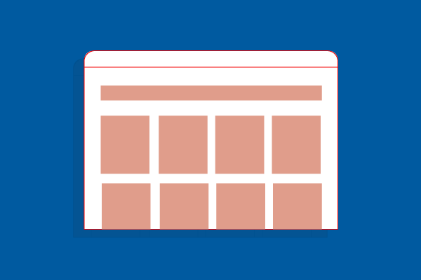
Grids
The utilization of the grid is attractive to the eye from a mathematical standpoint. Although the grids are not apparent in the design, they help with element placement, proportional distribution, and interface consistency.
Grids provide visual balance and order to a design, which makes content easier for people to consume. At the same time, grids can offer a lot of flexibility in a web layout. The majority of grid systems use either 12 or 16 columns with gutters in between.
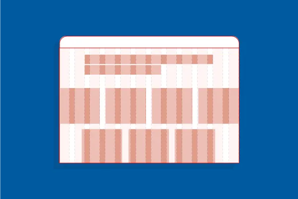
Asymmetry Layouts
In the simplest terms, asymmetry is the absence of symmetry. In design, asymmetry creates a more dynamic and organic visual impact. In most cases, asymmetry is created using images and text that do not perfectly balance each other.
Since asymmetry creates a dynamic, energetic visual impression, it’s useful for brands that want to communicate that kind of image. Asymmetry can also be unexpected, making designs more memorable.
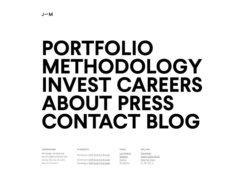
Big Typography
Big typography has been around since the advent of the web but gained popularity when mobile design became prevalent.
Large type is especially popular in headings and titles, but it’s also seen in body copy on some sites. When the right font is chosen, larger text is more readable and improves the user experience. Plus, it makes a powerful visual statement. It’s particularly popular in minimalist design, where other visual elements are mostly absent.
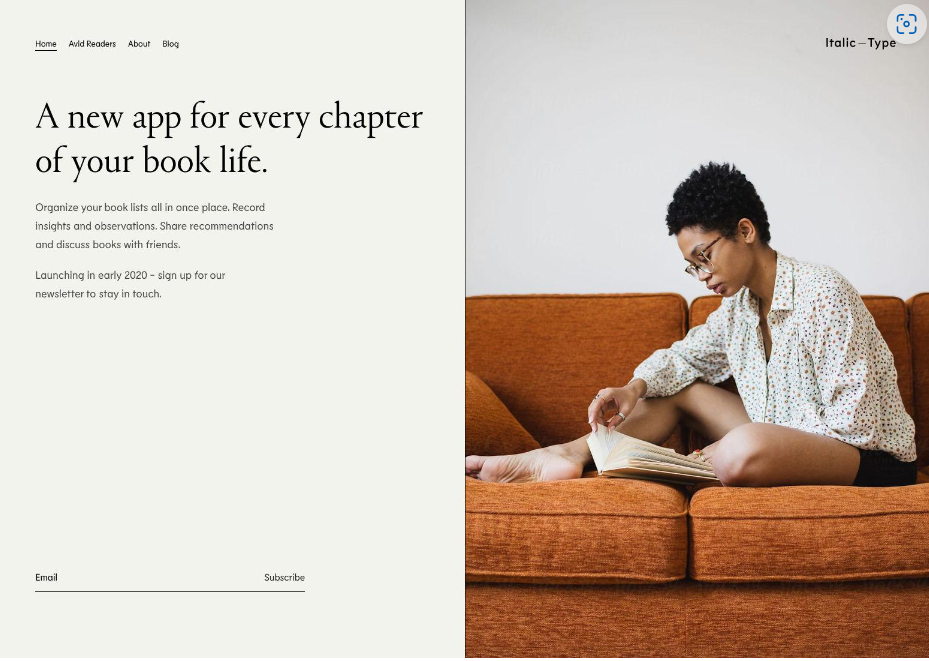
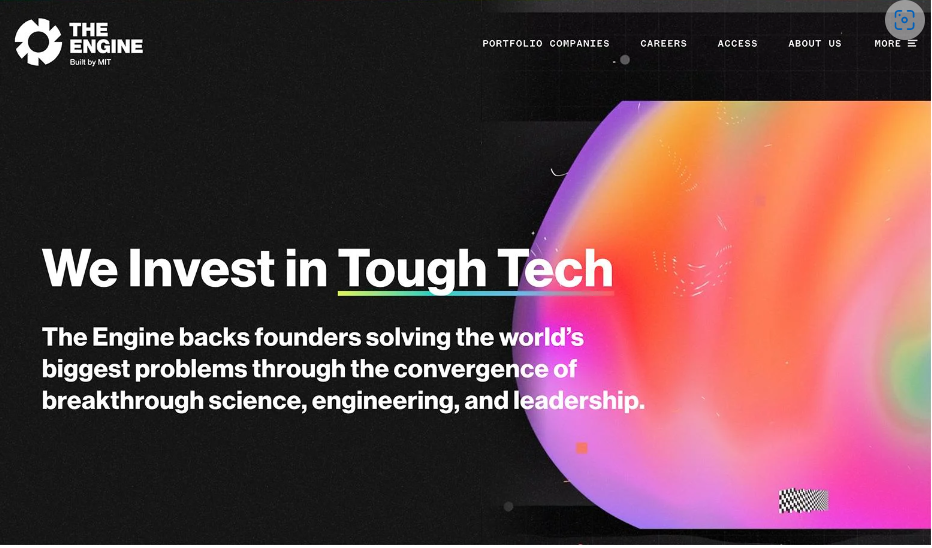
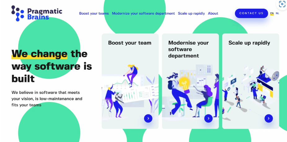
Split-screen Layouts Patterns
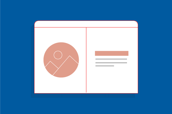
Split-screen layouts are a popular design choice when two elements need to have equal weight on a page and are often used in designs where text and an image both need to be featured prominently.
Split-screen designs are particularly well suited to product pages on eCommerce sites. Product images need to be prominent on these pages, but so does essential information like price, specifications, add-to-cart buttons, and product options.
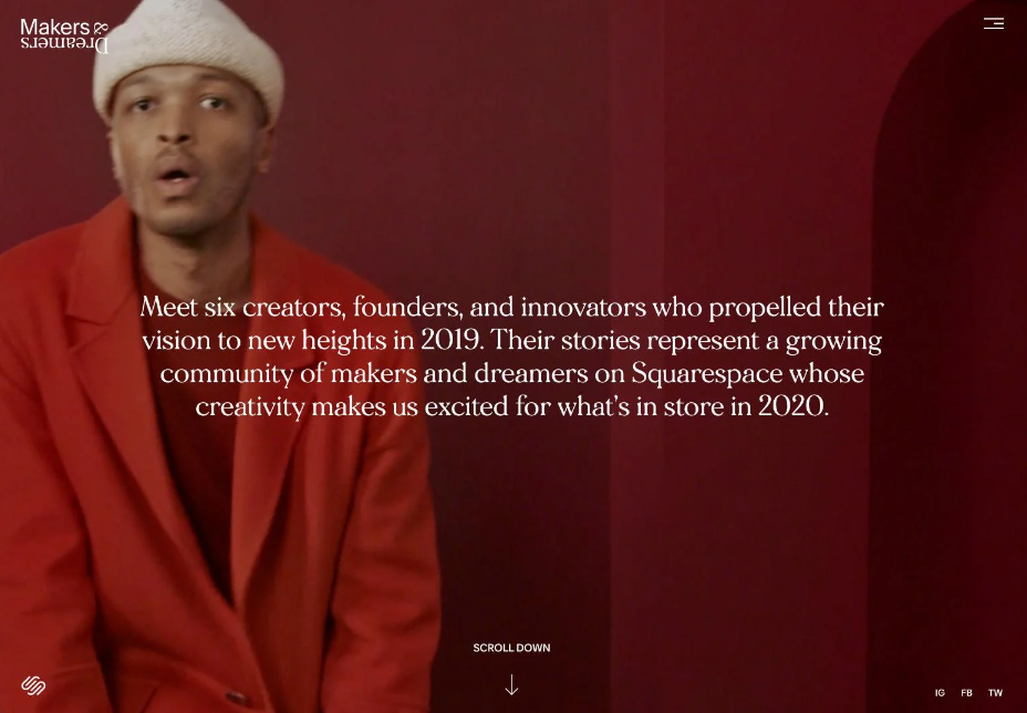
Simple Single-page Layouts
Single-page layouts put all of the primary content for a site on a single web page. Navigation is done through scrolling, often with shortcuts to jump to particular sections and sometimes with parallax scrolling effects.
Single-page website layouts are an excellent solution for sites with sparse content. They’re also a perfect choice for narrative content, such as interactive children’s books. Also well suited for mobile views.
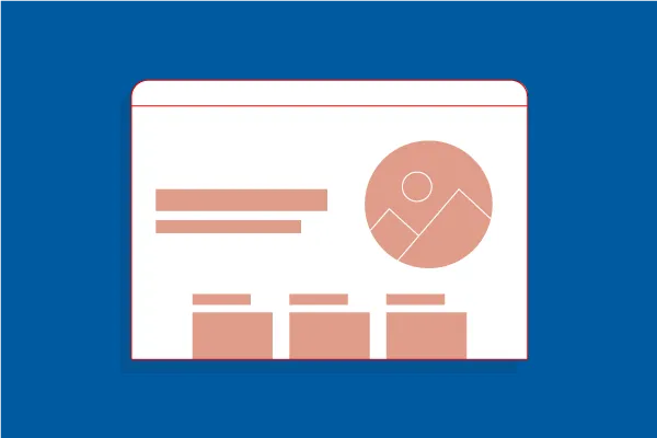
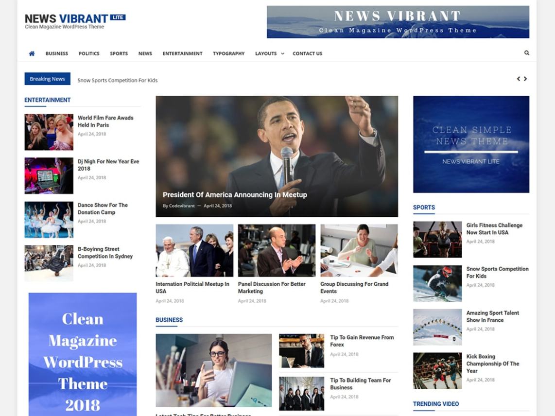
Magazine Web Layouts
Magazine-style layouts include a featured article (or sometimes multiple featured articles in a carousel or similar format), as well as secondary and tertiary articles on the homepage. They also tend to have multiple columns for content, sometimes divided into sections. These web layouts work well for sites with a great deal of content, particularly those with fresh content added daily.
Personalization
Personalization algorithms have been around for years, tailoring digital experiences to each person’s preferences. AI has made these algorithms even more useful, with features like suggestion algorithms that can now accurately predict what a person will want to watch, read, learn, or purchase next.
With membership sites, people want to see content that meets their wants and needs. Based on subscribers’ previous choices, Netflix has superior predictive algorithms that offer the movies and shows they’re most likely to watch. Sites like Medium show people articles they’re likely to enjoy when they log in, based both on what they’ve read and enjoyed previously.
Let’s do a quick exercise! Match each slide with it’s layout category.

Composing a layout
Layouts are the culmination of defined spatial rules and the organization of content into one single composition. Bringing together your content into thoughtful structures is the easy part, making it all flow together with a clear hierarchy across a sea of changing platforms and screen sizes is the hard part.
Defining the scaling logic is now a requirement for both native and web apps. From desktop to mobile and everything in between, the screen sizes and scales can vary widely. There are three main concepts for crafting a layout that can scale gracefully. Some designs will call for all three of these concepts at once.
Adaptive
An adaptive layout is one that changes entirely based on the format it is presented in. For example, loading different experiences based on desktop, tablet, and mobile devices. This promotes a more tailored experience for the user’s device but can become expensive to rebuild the same functionality into multiple formats.
Responsive
A responsive layout is fluid and can adapt to a changing format size. This is a common practice on the web and has become a necessity for native apps as screen size variations have increased. This allows you to build a feature one time and expect it to work across all screen sizes. The downside is that touch and mouse interactions are very different and it’s expensive to account for all devices and use cases.
Strict
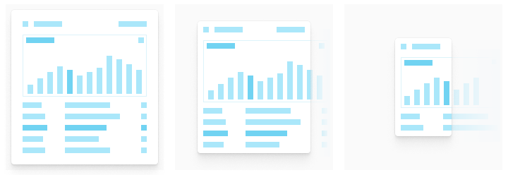
This layout will not flex with a changing format size. Fixed layouts are often used to promote a specific interaction or informational layout that would be degraded at a smaller size. Data tables and graphs will often create a scrollable strict layout at a specific size because the legibility and interactions would be significantly degraded below a certain size.